Problem Space
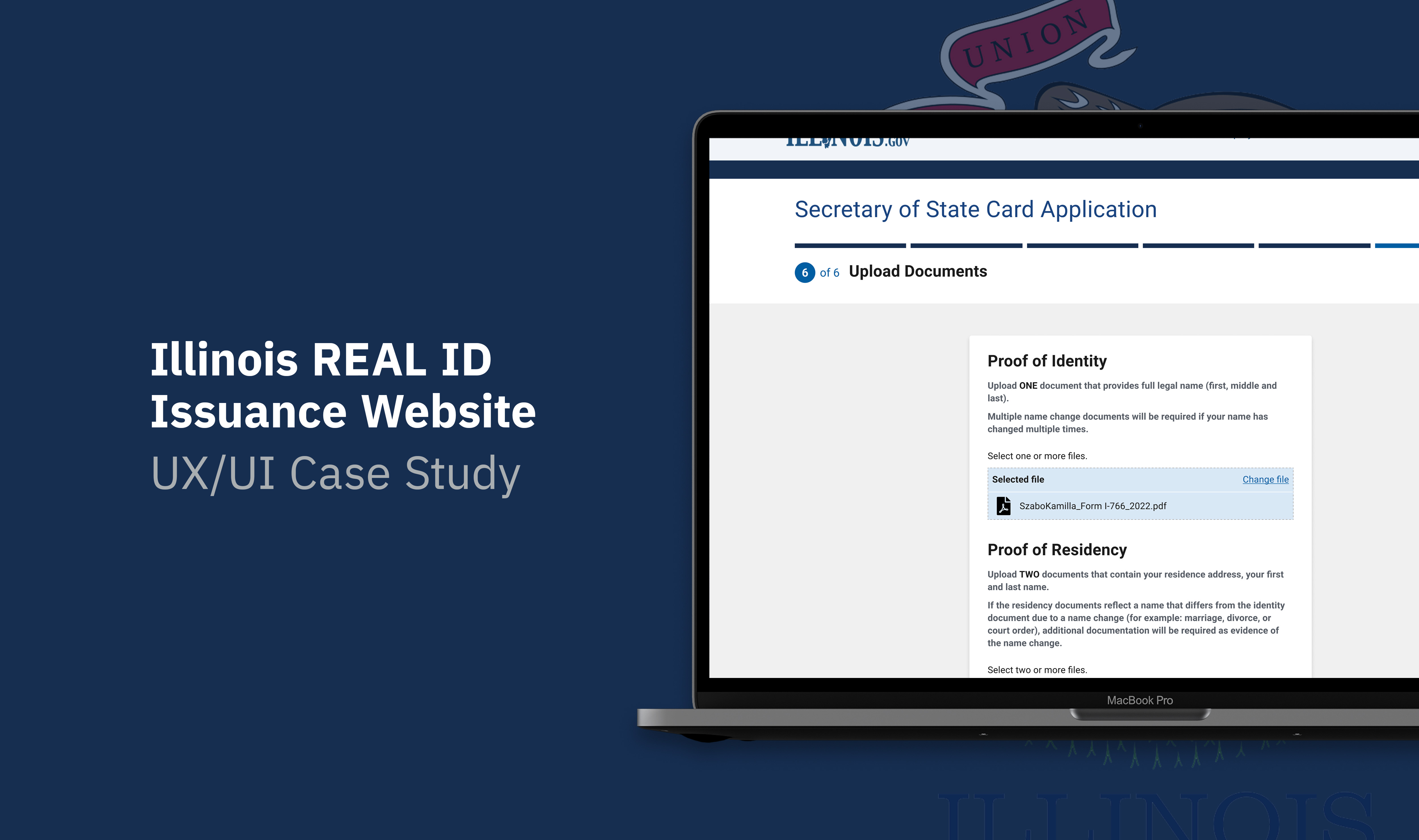
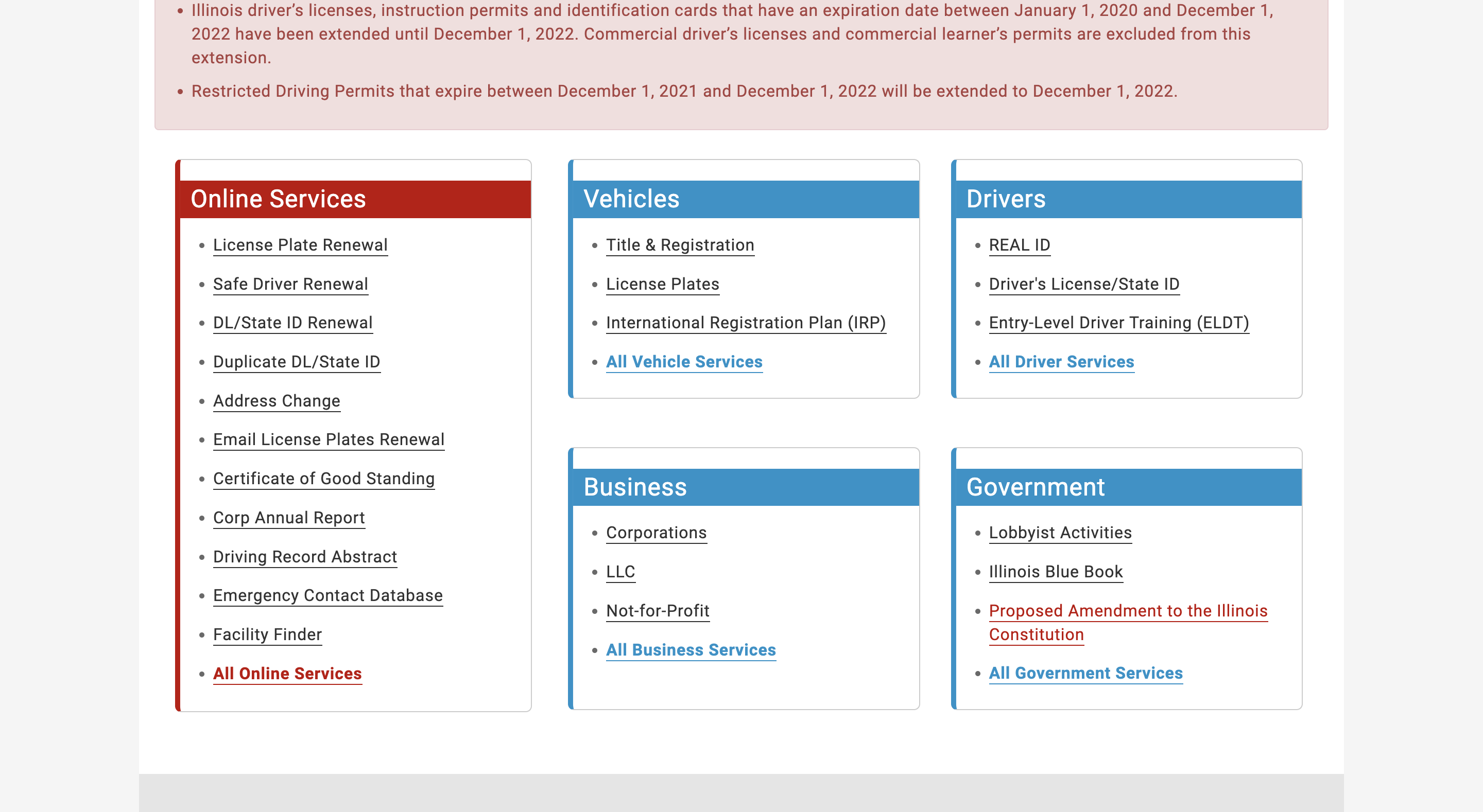
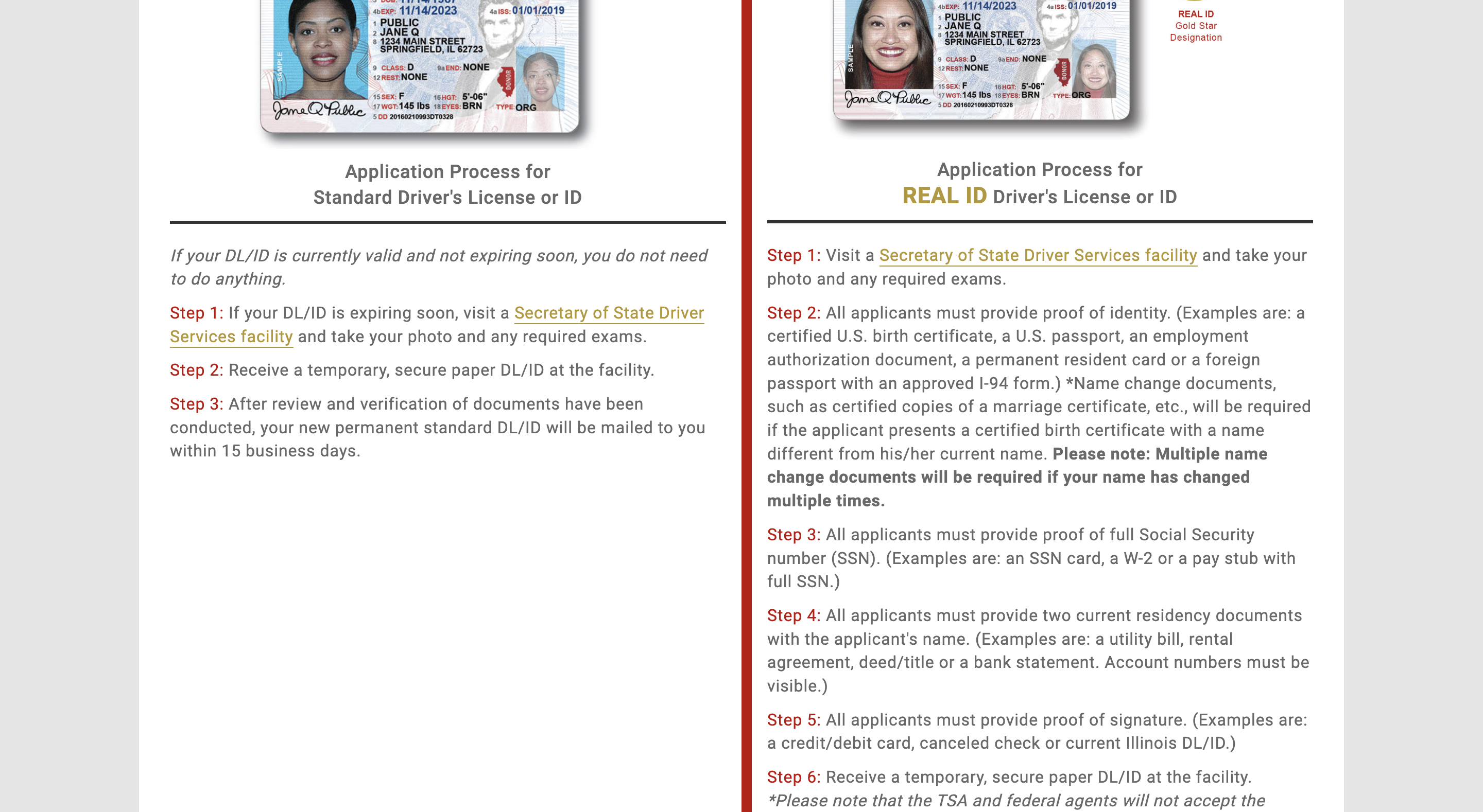
When I was trying to create my first REAL ID in Chicago, I found the website of Illinois Secretary of State is non-user-friendly, as the way the information is shown is pretty complicated and repetitive, with the following visual problems:
- Too many texts
- Unnecessary components (e.g. underlined texts)
- Wide legth of paragraphs
- Tight space between margins and texts
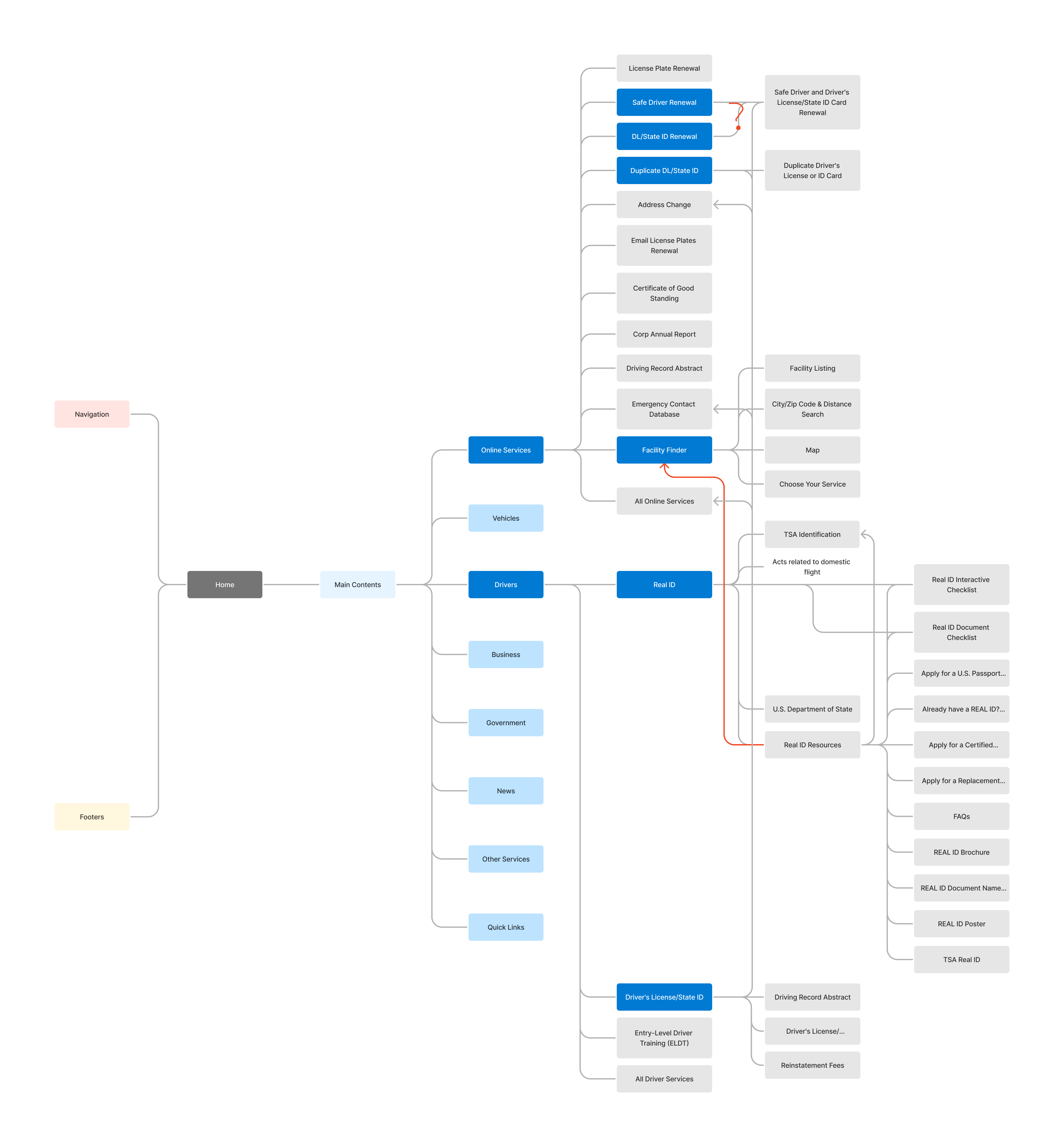
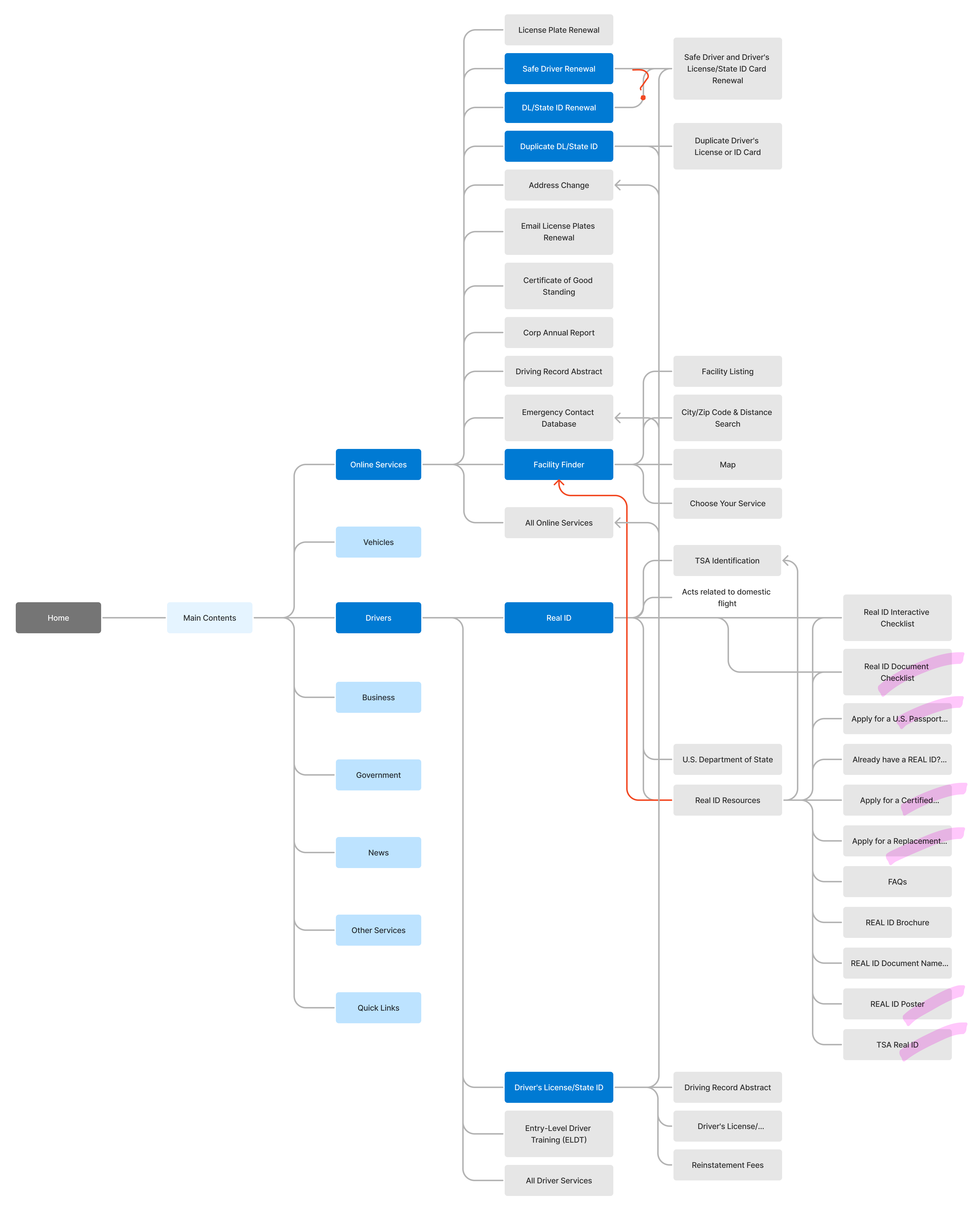
I wanted to visualize the sitemap to figure out why I struggled with getting the information I needed. The following are what I found as content-wise problems in the sitemap:
- Multiple menus are linked to the same webpage.
- Most necessary information is displayed in deeper depth, while less necessary information is easily seen.
- REAL ID information is included to a wrong category. (e.g. Drivers - REAL ID)
Also, the current process is inconvenient because you have to bring all the required documents to the office. All of the causes above led me to raise the following question:
How might we make people who want to create/renew REAL ID feel convenient and satisfied with the process of getting REAL ID and its information in the website of Illinois Secretary of State?
The Solution
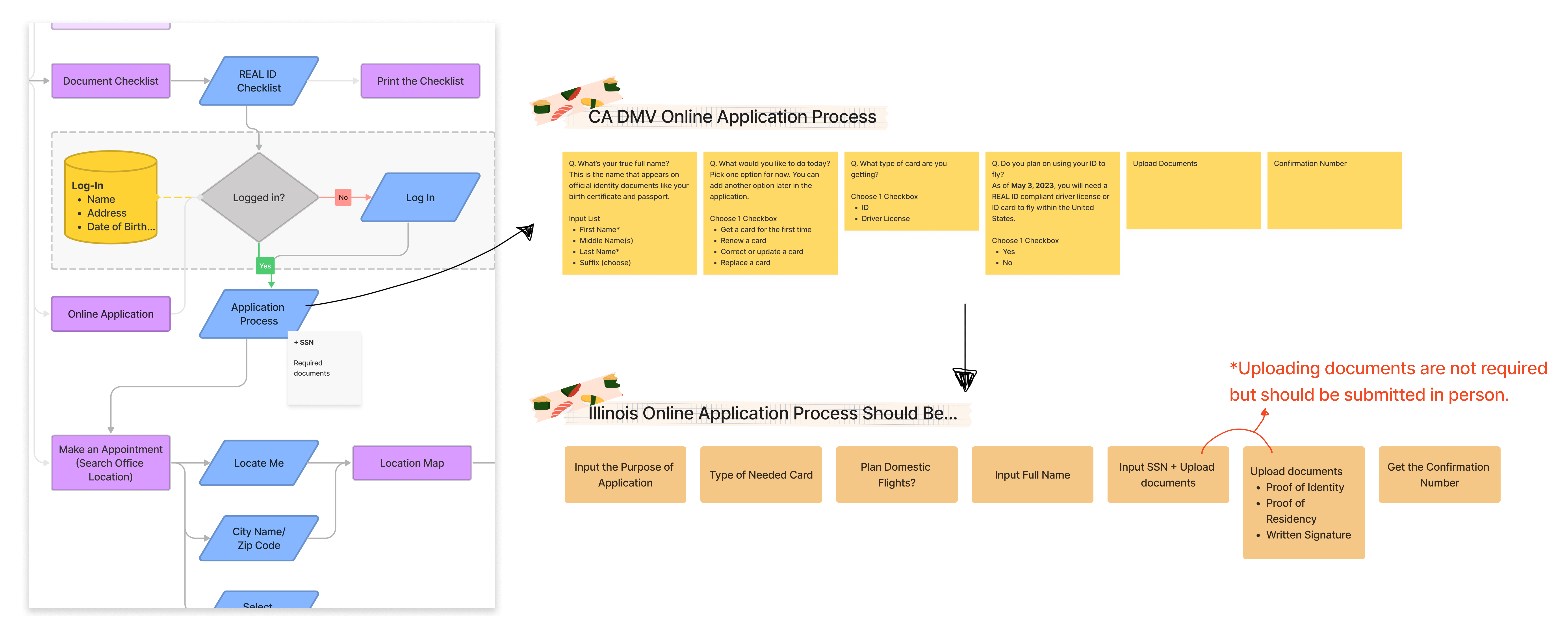
In order to handle as much work online as possible, I designed an online application and an appointment system, which has already been executed in the California DMV that I referred to.
Research
I began the research by looking for competitors’—other states’—websites, such as Michigan of State, California DMV, Oregon of State, New York DMV, Massachusettes of State, and Florida HSMV. When researching the competitors websites, I saw they shared a similar color palette, and found there is a design guideline for federal government websites.
U.S. government gives the latest news and information about a design system for the federal government on U.S. Web Design System (USWDS). It provides principles, guidance, and code to help developers and designers design and build accessible, mobile-friendly government websites and digital services.
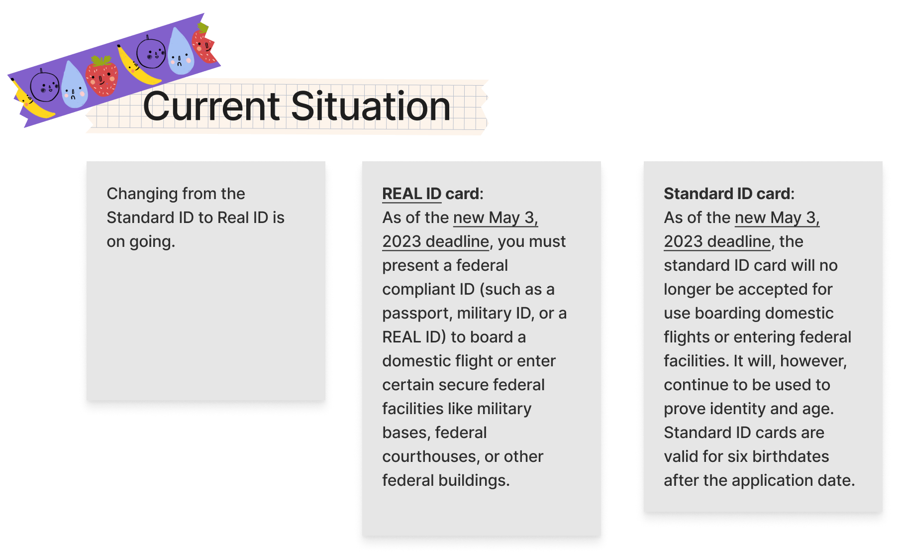
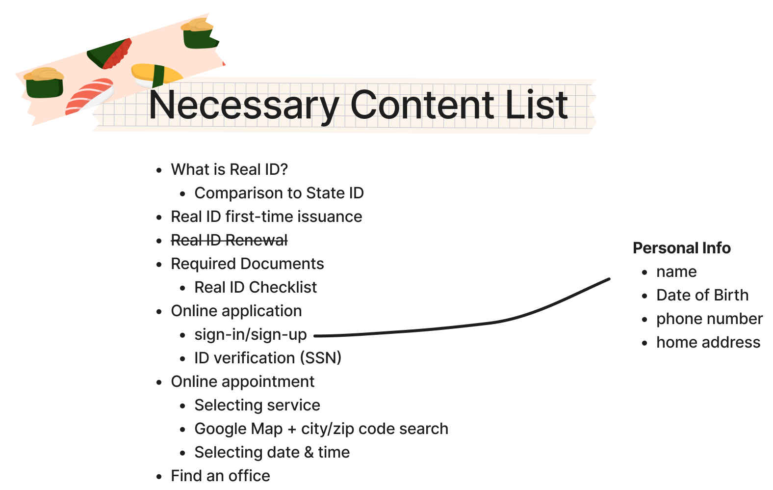
Before getting into the design process, I checked off the repeated menus or inessential information. Then I put together the essential contents and the current situation associated with the federal government trying to make citizens create/change their current ID card to a REAL ID.
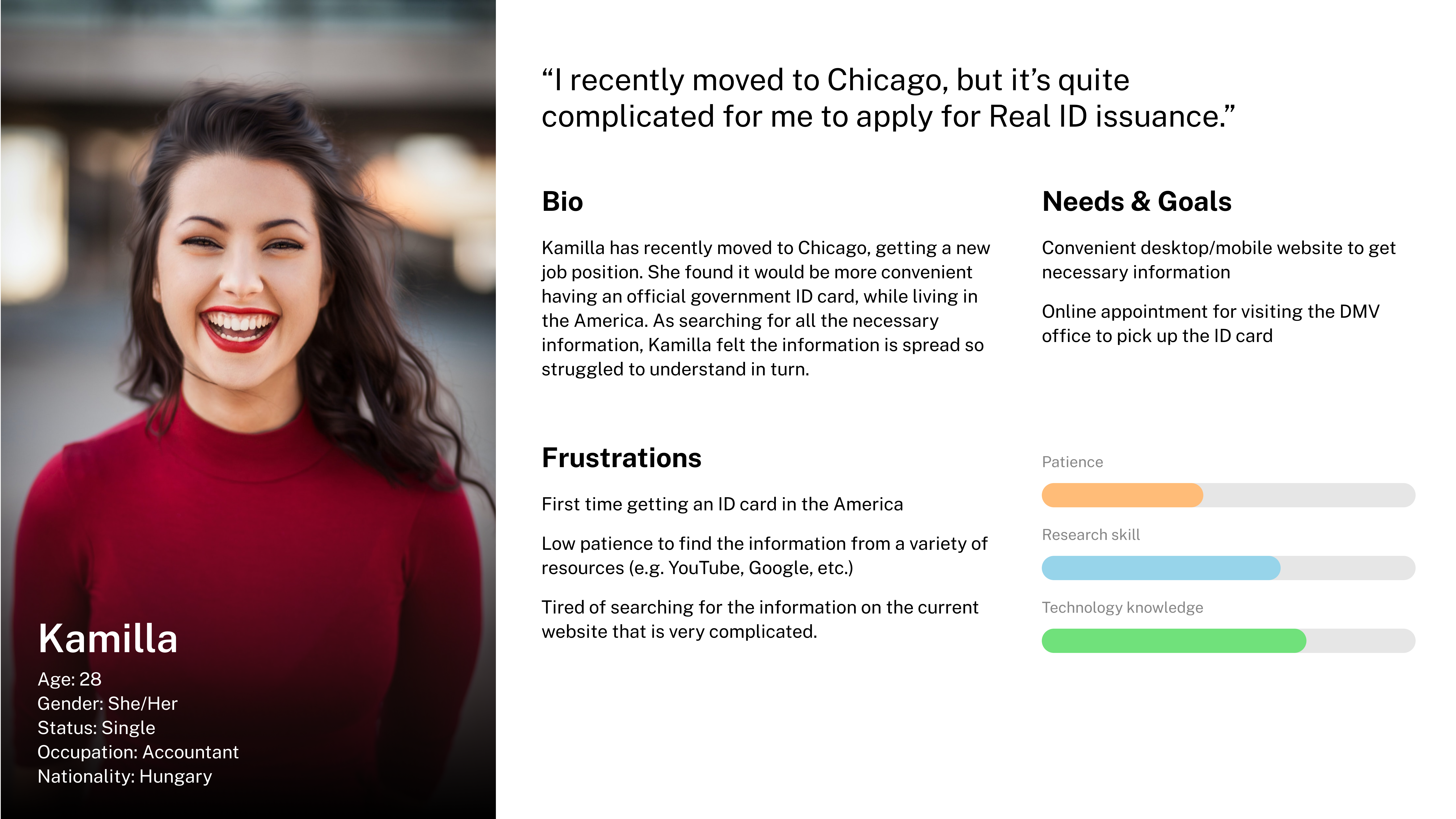
Persona
User Flow
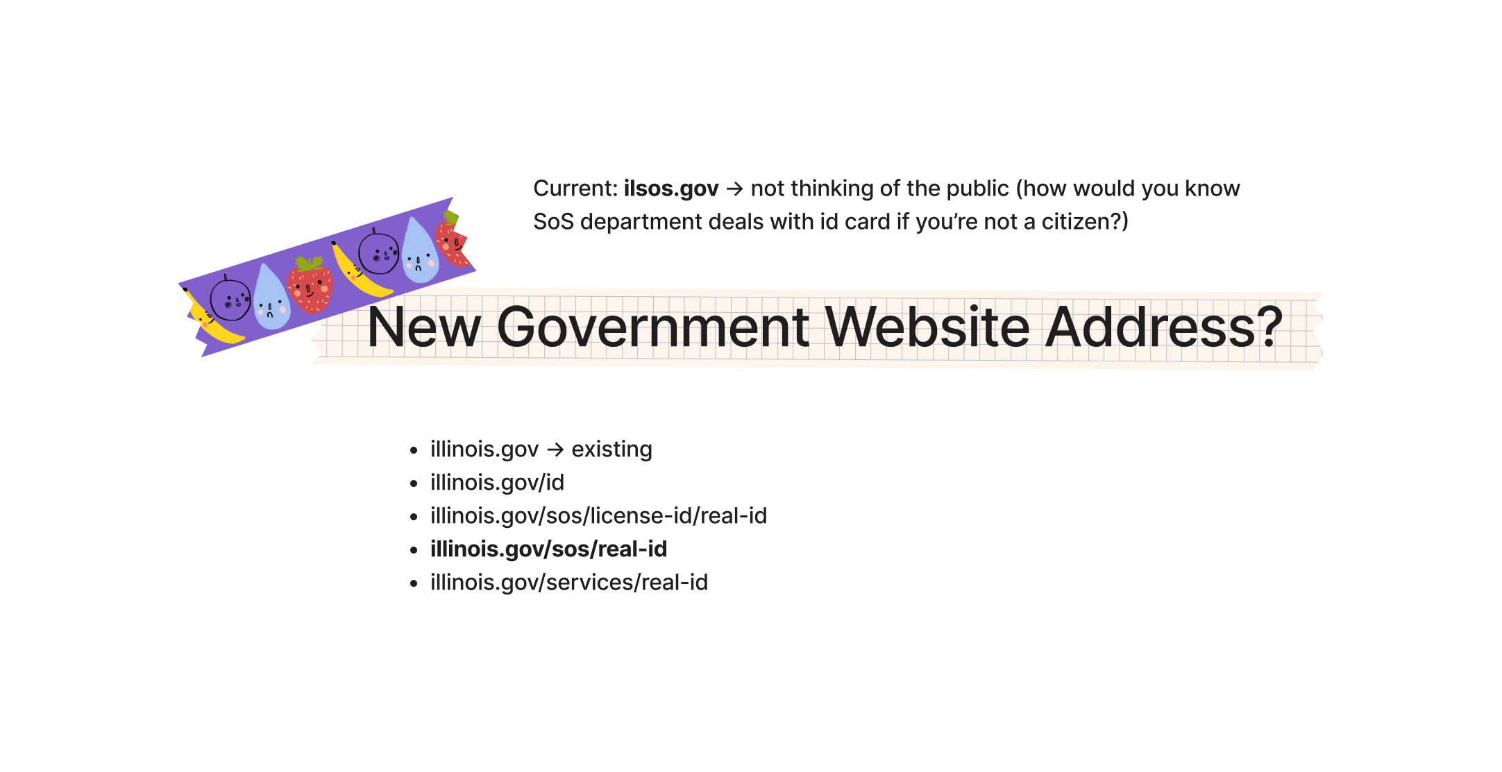
After creating the persona for the design and before making the user flow, I had to decide which website the design would be placed on—either the Illinois government’s website or the website of the Illinois Secretary of State. I decided to put it on the Illinois government’s because the website would be the first one that people look for, then imagined what the website address would be.
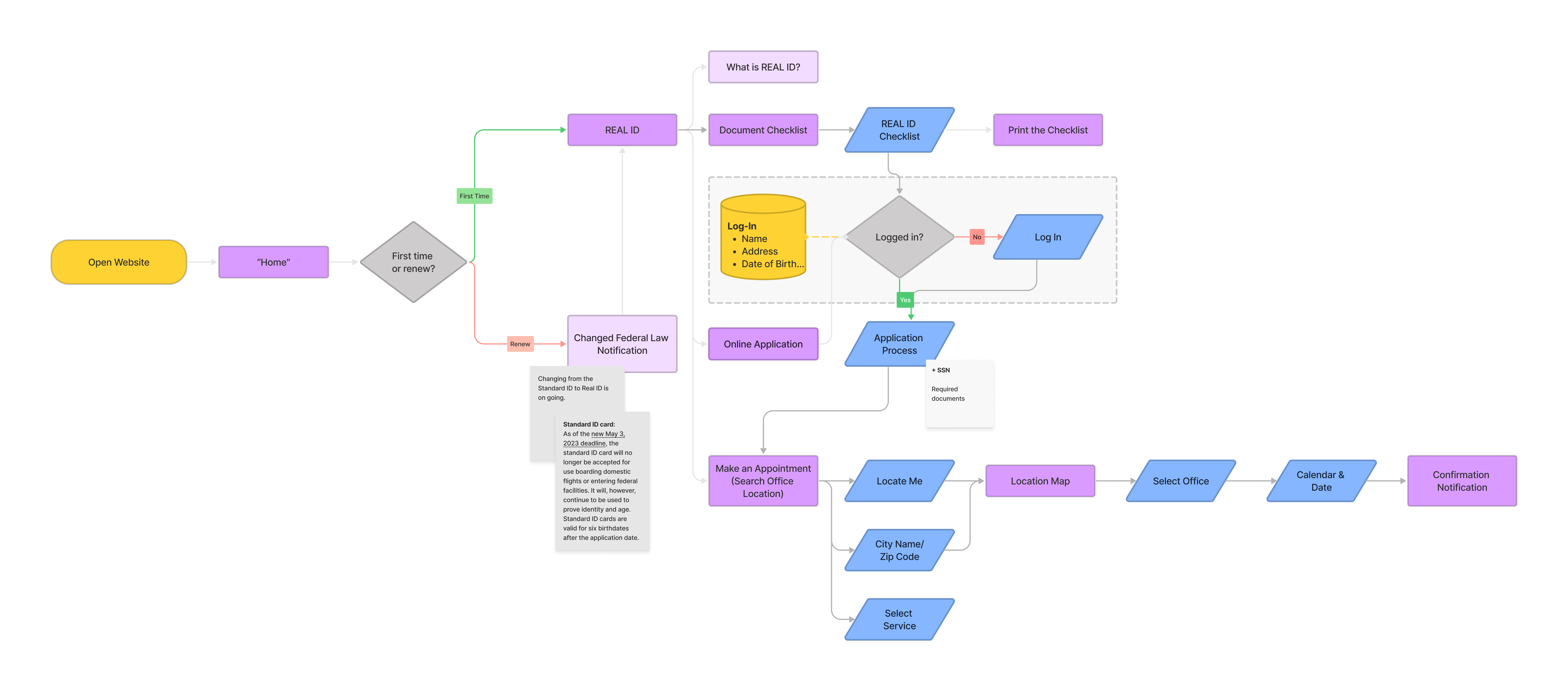
The next challenge was how to set up the online application process. One of the competitors, California DMV has a great online application process, and I referred to theirs and adjusted it for Illinois’ based on the Illinois law.
Challenges
Modal Window for Promotion
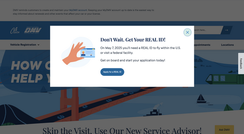
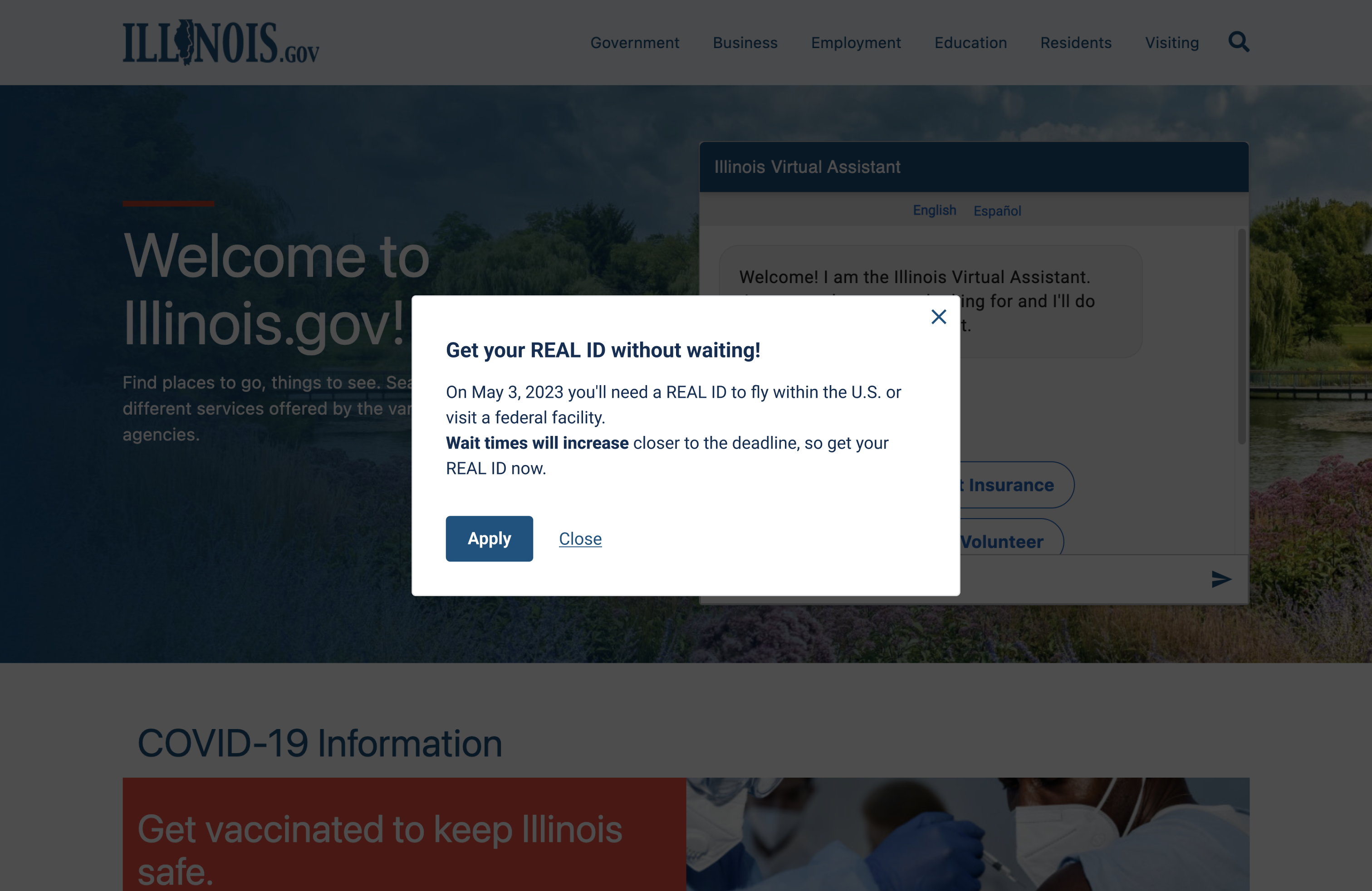
Considering how to promote people change thier existing ID to a REAL ID, I referred to California DMV’s modal window at the beginning of the web page, which I thought is a great idea for promotion.
![]()
![]()
Considering how to promote people change thier existing ID to a REAL ID, I referred to California DMV’s modal window at the beginning of the web page, which I thought is a great idea for promotion.
Accordion Bars for FAQs
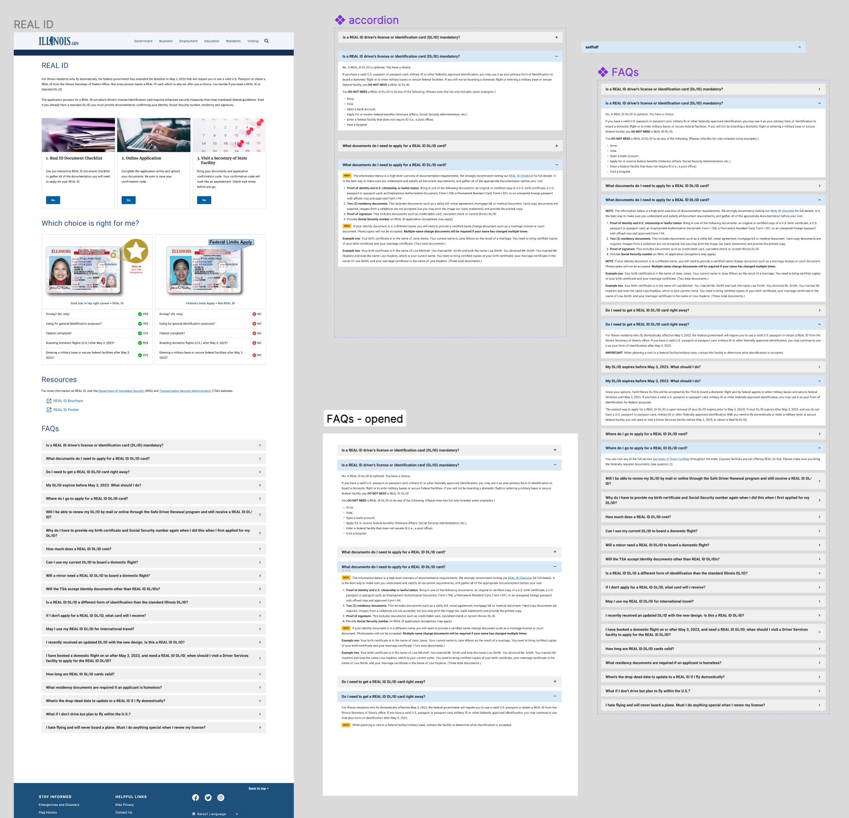
I had a technical challenge for the accordion bars for FAQs, which is animating the components—expanding/closing each of the accordion bars by clicking.
![]()
I had a technical challenge for the accordion bars for FAQs, which is animating the components—expanding/closing each of the accordion bars by clicking.
REAL ID Document Checklist
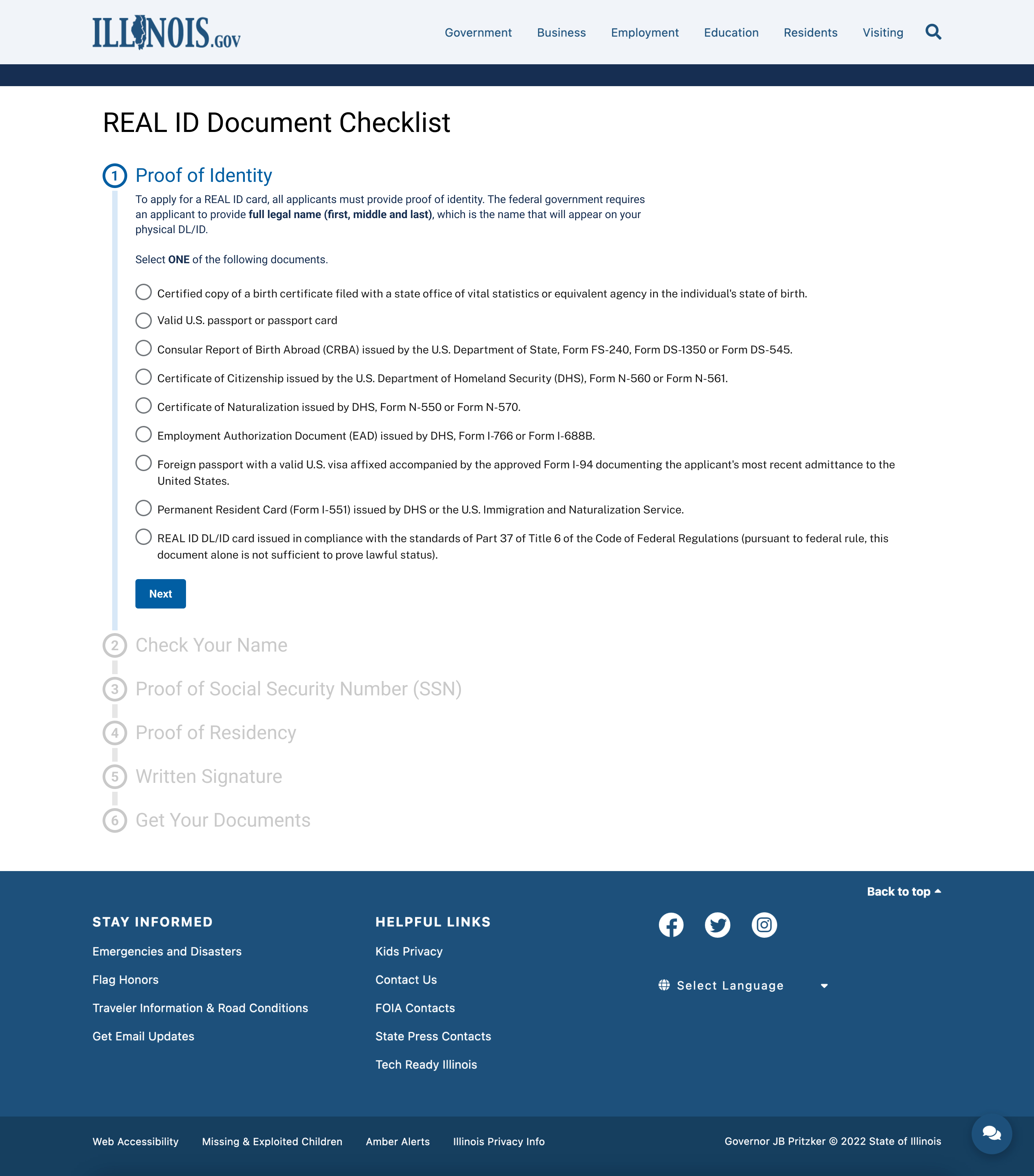
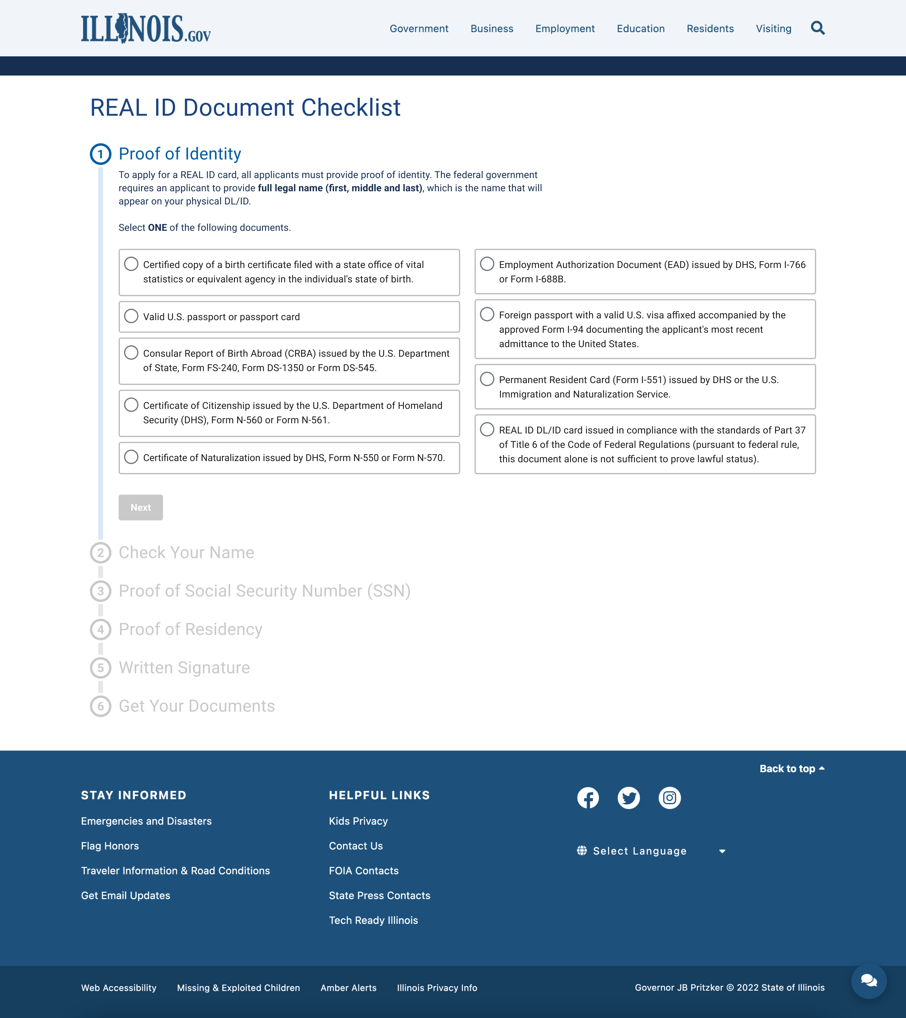
I designed two options for the checkbox on the REAL ID Document Checklist pages. Even though I preferred the first one regarding the visual design, my friends preferred the second one because a form of bordered box shortens a width of a long text line and makes a readability.
![]()
![]()
I designed two options for the checkbox on the REAL ID Document Checklist pages. Even though I preferred the first one regarding the visual design, my friends preferred the second one because a form of bordered box shortens a width of a long text line and makes a readability.
Secretary of State Facilities
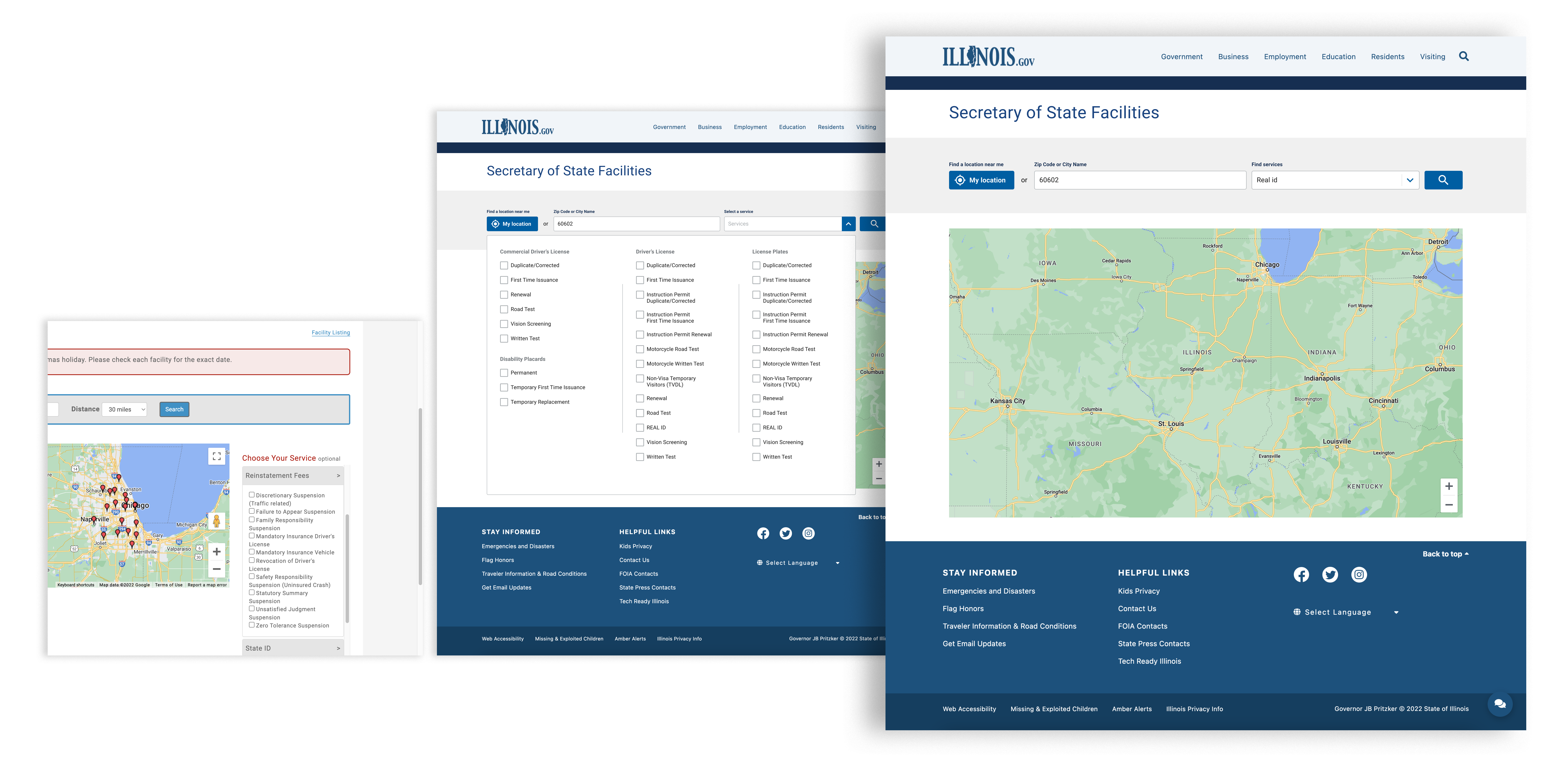
I was going to put all of the service options for the “Select a service” feature. However, there are too many options and several repeated options, so I decided to make a user type a desired service and select a fixed service, which would shorten the time to find the service.
![]()
I was going to put all of the service options for the “Select a service” feature. However, there are too many options and several repeated options, so I decided to make a user type a desired service and select a fixed service, which would shorten the time to find the service.
Wrapping-Up
Since the website's services are somewhat interconnected, I had to specify the range of deliverables as I crossed out the extraneous data and combined the essential so that the project is mainly about the REAL ID. When looking at the sitemap, I believed it was a mistake that menus in lower categories were linked to those in higher categories, although occasionally this is allowed. I realized that I have to check what kind of input box to add in wireframes as a designer, whereas we simply type the information in the input boxes to submit an application.
When working on the REAL ID Document Checklist page, I considered which kind of checkbox to put between one column and two columns. I preferred the one-column design despite the fact that the two-column design would be more user-friendly. However, my friends reminded me of the importance of user-friendly design rather than the visual, as they told me the two-column design felt more convenient, which is my final goal for this project. I felt again that I have to choose a design that is more user-friendly yet less good-looking in the visual aspect, because as wireframes are different from the editorial design, they should focus on improving user experience.
If you want to try the project, you can check it out on this link.